


These days, many eyecare practitioners use social media to promote their practice, market their services, and connect with patients. Platforms like Instagram can help provide valuable exposure to the public.
However, regularly creating new content and engaging online takes time that you may not have, or may necessitate hiring dedicated marketing staff to keep up with engagement.
Understanding the fixed grid system on Instagram
Instagram's fixed grid system is a useful approach for those looking for a professional social media presence without the demands of daily posting and interaction. You may have noticed some businesses embracing fixed grids as a visual strategy on Instagram, which has made it easier for brands to create an organized, eye-catching profile without needing daily upkeep.
As an independent eyecare practitioner, you may also find implementing this fixed grid system helps streamline your own social media approach. It could be an efficient way to establish your brand on social media without significant time or financial investment.
What exactly is a "fixed grid"?
The fixed grid consists of a 3x3 layout of individual aesthetic posts that work together like a branded mini-website. Used in combination with strategic captions and innate features like video and carousel posts, these grids strategically showcase information to maximize each profile’s impact.
While not completely hands-off, the fixed grid is one way that busy doctors can create a lower-maintenance social media presence without committing to the hectic pace that is the norm for many businesses that market on the platform.
Is a fixed grid the best option for your Instagram profile?
When deciding whether a fixed grid is the best option for your Instagram profile, consider the factors below.
The fixed grid works best for practices that:
- Don't rely heavily on Instagram for patient engagement
- Prefer to focus marketing efforts on other platforms or modalities
- Want to step back from actively posting while still maintaining a professional presence
- Are new practices looking to secure their desired handle
Fixed grids may not be the best fit for practices that:
- Have highly engaged followers expecting constant updates
- Can't commit to periodically refreshing content
- Rely solely on Instagram as a marketing platform
- Rely on active organic promotion to reach new patients
Download the guide to fixed grids for your eyecare practice below

How to Create Fixed Grids for Your Eyecare Practice with Templates
Featuring easy-to-use templates for eyecare practitioners to build their own fixed grid system, discover how to optimize the Instagram account for your eyecare practice.

Creating captions for your fixed grid
Carefully planning each row’s caption is crucial when creating an effective grid. It’s important to determine the purpose of each square to give your story structure.
Top row
While there are infinite possibilities, optimizing your top row is especially important, as new viewers interact with this section of your profile more than any other. Use it to make a strong first impression—highlight credentials, introduce your team, and explain booking.
Middle row
Build trust in the middle row for visitors wanting to learn more after your introduction. Use these squares to talk about reviews from patients, what you know about taking care of patients, or that special piece of tech you use. Social proof and additional information help potential patients understand why your practice is the best choice for their vision needs.
Bottom row
Use the bottom row to continue building relationships with potential patients who need or want more information about your practice. Address frequently asked questions, link to your website, and promote booking. Make it easy for visitors to take the next step.
Visual strategy for your 9-grid
Visual designers and graphic designers use a wide range of skills to make the impressive 9-grids that you can find on many online profiles. If you are able to hire someone, look for a designer who is familiar with Instagram and social media aesthetics.
Provide examples of accounts you admire and your brand guidelines. Collaborating with a professional can visually elevate your grid to the next level.
However, non-designers can also make a grid that looks good and fits together if they follow a few simple rules:
- Decide on the visual pattern you want to follow, the most common are listed below.
- Use only one to three consistent brand colors to tie your images together. Using similar colors or filters will visually connect your grid and keep you from going overboard with color.
- Select one go-to font for all of your text overlays.
- Think about the empty space around your images and frame them to make the most of the negative space and avoid a cluttered look. Leave breathing room around your subject and resist cramming edges. The empty space will make the grid cleaner and more professional.
- Using your own professional-quality photographs is ideal, but free stock photography websites are also widely used. To achieve cohesion, look for stock images that include a splash of your brand color. Just remember to follow the licensing guidelines for free stock sites.
4 examples of different 9-grid patterns
1. Borders
Using identical borders on each post is one of the simplest ways to make your grid look cohesive. Borders create a consistent, repetitive aesthetic that projects a minimalist, elevated look by adding tidy extra white space around images (Figure 1).
The Instagram app includes a built-in feature to easily add borders to your posts. To maintain a uniform aesthetic, apply the same border width and style to each image in your grid. This repetitive framing ties the visual flow together, keeps it clean, and lets the content in each post stand out.
Figure 1 shows an example of a fixed grid layout using images with repeating borders.

Figure 1: Courtesy of Anita Purdy, OD.
2. Checkerboard
You can use this grid style in a few ways. One way to make a checkerboard grid is to use two solid background colors that alternate with your images (Figure 2). An alternative way to re-imagine the checkerboard pattern is to introduce a brand color through written text (Figure 3). This is ideal for practices that enjoy sharing inspirational quotes or eyecare tips.
Figure 2 is an example of the checkerboard layout using solid color blocks.

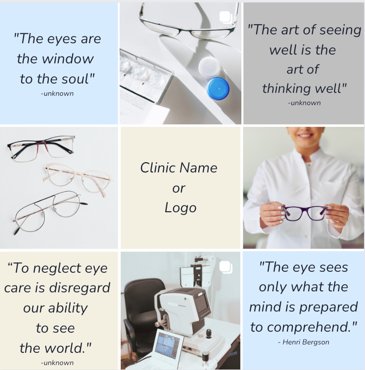
Figure 2: Courtesy of Anita Purdy, OD.
Figure 3 is an alternative interpretation of the checkerboard layout emphasizing text colors.

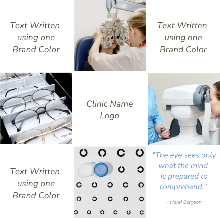
Figure 3: Courtesy of Anita Purdy, OD.
Don’t be afraid to experiment with different color schemes and content strategies to see what works best for you!
3. Center column
Instead of alternating the colors of the blocks, you can bring visual attention to the content of each row by emphasizing the center column with color blocks (Figure 4).
Figure 4 highlights an example of the center column layout.

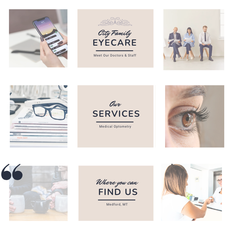
Figure 4: Courtesy of Anita Purdy, OD.
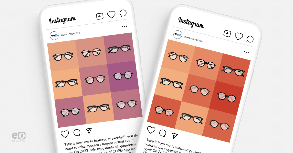
4. Repetitive shapes or objects
Repeating branded shapes or visuals in each grid square creates an artistic, recognizable style (Figure 5). For optometry, use recurring items like eyeglasses, charts, or eye graphics. Keep compositions unique while repeating objects. This reinforces themes through consistent visual motifs.
Figure 5 features an example of repeating shapes in a fixed-grid layout.

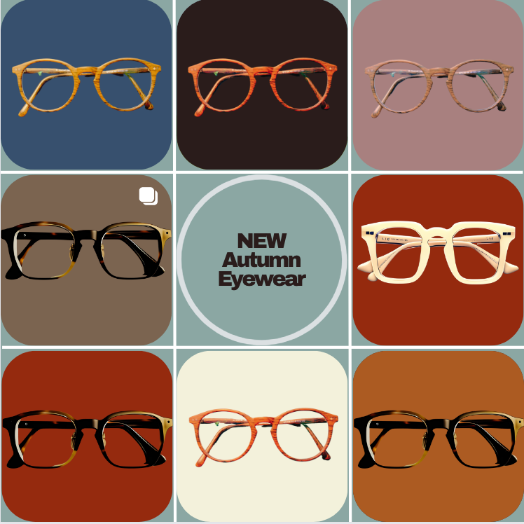
Figure 5: Courtesy of Anita Purdy, OD.
Conclusion
Busy eyecare professionals looking for a way to establish their brand presence on Instagram in an organized, engaging, and time-efficient manner may choose to use the fixed grid system for posting.
With some strategic planning for content, captions, and visuals, practices can showcase their services and expertise to prospective patients in an eye-catching, consistent format that brings many time-saving benefits over standard posting.
Although constructing the initial grid takes some time and thought, the long-term advantages are well worth the initial investment. So, whether you handle your own social media or outsource your marketing, consider using a fixed grid to highlight your practice.
With careful planning, these grids can become a go-to system in your marketing toolkit, catching people's attention and leading interested potential patients to learn more about your practice and services.
